Pantone color trends often used by designers at Salone del Mobile 2017! Take a look at the top 5
Salone del Mobile is a forum of creativity, design and innovation where the world’s top designers and emerging talents present and help build the industry’s biggest trends. After roaming around the headquarters at Fiera Milano, Rho, we spotted a few interesting color pallets that were selected by the exhibitors.
According to Pantone the year of 2017 is all about bringing interiors to a whole new level with bright, lively colors that resemble the beautiful landscapes of Nature. At Salone del Mobile 2017 we could notice that designers often created fun twists and played with different shades, creating diverse and unique interiors for the exhibition.
From all the mess and diversity, 5 color trends definitely stood out. Take a look bellow.
Passionate Red
Brands such as Calligaris, gave another meaning to interior design with daring and passionate red contrasts that were balanced out evenly with minimal wood work. This color is perfect to accentuate the space and provide elegant yet fun details. Definitely a shade to consider using this season?
Baby Blue
This color is being selected by several brands and designers this year. The brand Infinity, for example, opted out for a minimal exhibition that consisted mainly on neutral furnishings and blue decorative walls, creating a serene and easy going design. A very wise decision in our opinion.
Flame Orange
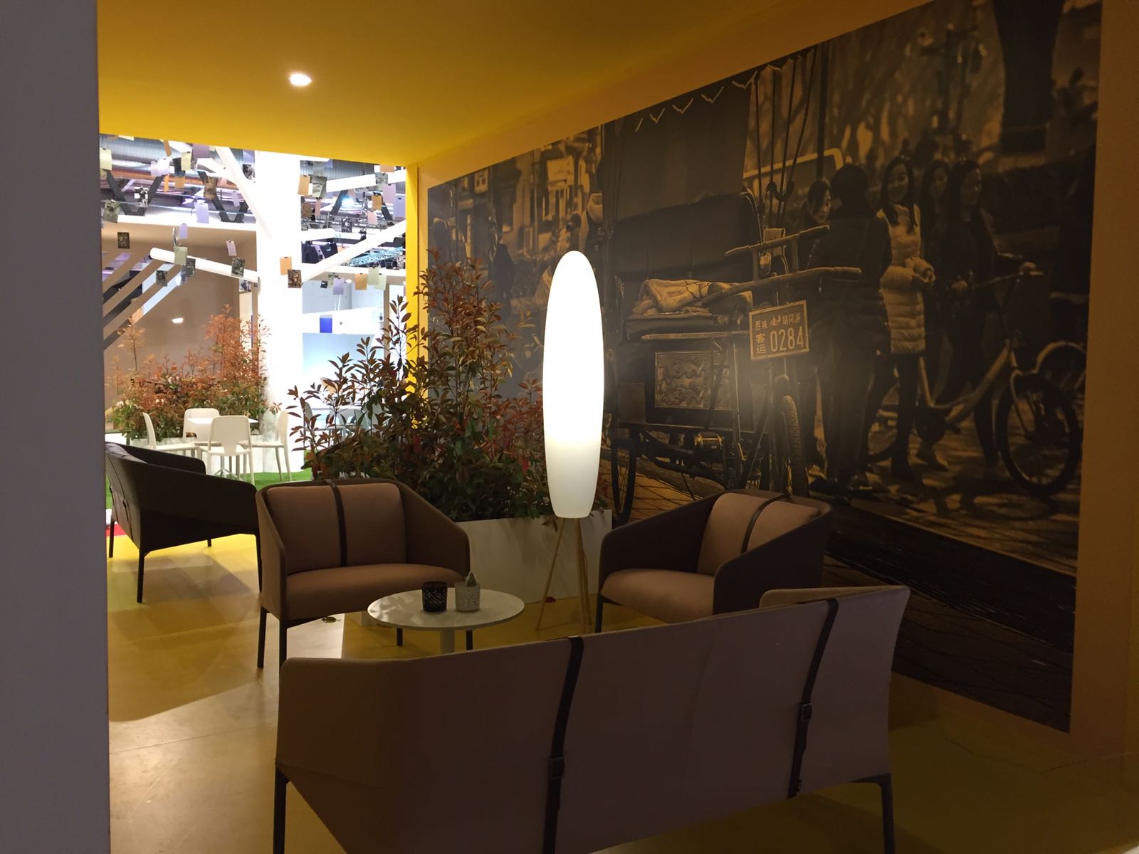
According to Pantone‘s color report, Flame Orange will be one of the most selected colors this season, and Salone del Mobile 2017 could confirm. This shade is vivacious and adds fiery heat to any interior design, and for that reason, several brands include it in their exhibition. Stunning!
Primrose Yellow
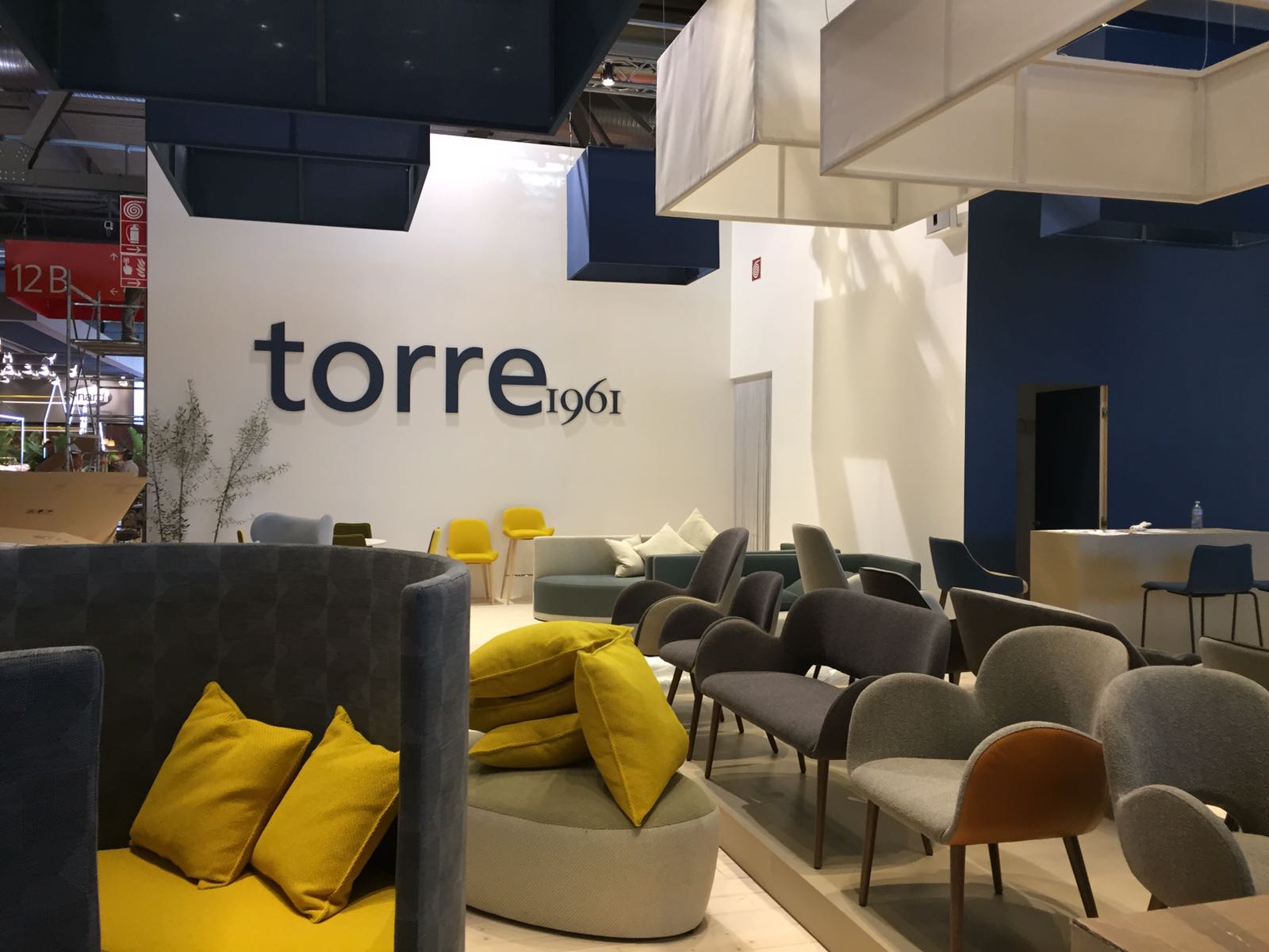
This beautiful shade was spotted several times at the event, creating an impact right away. Brands such as TORRE used it as a simple decorative element to add a pop of color to the neutral background while others used it the other way around. Simply a great color to choose.
Pale Dogwood
Pale Dogwood is a quiet and peaceful pink shade that engenders an aura of innocence and purity. This unique color was used by Miniforms, for example a base for stronger shades, what worked pretty well. This color trend adds a healthy glow to any environment and works perfectly in floor finishes.
COLORFUL FURNISHINGS YOU MIGHT ALSO LIKE
ELLEN | MAYA | SOHO
